


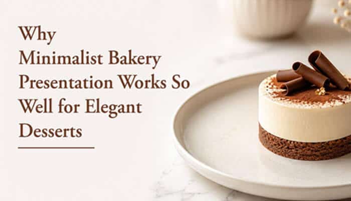

Minimalist bakery presentation works because it creates visual space around the dessert. Clean surfaces, restrained colors, simple typography, and carefully positioned branding allow the food to remain the main focus. Rather than competing with the product, the packaging frames it.
This approach is particularly effective for premium cakes, macarons, pastries, wedding desserts, and luxury gift assortments. Minimalist presentation can make these products feel more exclusive, modern, and carefully considered.
However, simplicity does not mean a lack of effort. Successful minimalist packaging requires precise decisions about structure, color, spacing, materials, product arrangement, and branding. Every visible element must serve a clear purpose.
Minimalism Directs Attention Toward the Dessert
The primary advantage of minimalist presentation is focus.
When a bakery package contains too many patterns, labels, colors, illustrations, and promotional messages, the customer may not know where to look first. The visual impact of the dessert can become weakened by the surrounding design.
Minimalist packaging removes unnecessary distractions. It uses a limited number of elements to guide the customer’s attention toward the product.
This may involve:
- A simple box shape
- One dominant color
- A clearly positioned logo
- Limited text
- Generous empty space
- A restrained typeface
- Neat product arrangement
For elegant desserts, this approach allows delicate textures, colors, and decorative details to become more noticeable.
Clean Presentation Suggests Precision
Customers often connect visual order with careful preparation.
A neatly packed dessert inside a clean, well-proportioned box may suggest that the bakery pays close attention to ingredients, decoration, hygiene, and customer service. This perception is especially important for products sold at premium prices.
Minimalist presentation communicates confidence. The bakery does not need to fill every surface with decorative elements because the product and brand are strong enough to stand on their own.
A precise presentation may include:
- Straight labels
- Consistent spacing
- Clean folds
- Sharp printed details
- Centered products
- Matching inserts
- Unmarked surfaces
Small imperfections become more visible in minimalist design, which means quality control must remain high.
White Packaging Creates a Refined Background
White is commonly associated with cleanliness, simplicity, lightness, and elegance. In bakery packaging, it provides a neutral background that allows colorful desserts to stand out.
Chocolate, berries, gold decorations, pastel frosting, and bright macarons can appear more visually prominent against a white surface. This contrast makes the product feel carefully displayed rather than simply contained.
White packaging is especially suitable for:
- Wedding cakes
- Bridal shower desserts
- Luxury pastries
- Premium cupcakes
- Macaron assortments
- Celebration cakes
- Corporate gifts
- Minimalist bakery brands
The color also provides flexibility. A bakery can adapt the same base packaging for different seasons and occasions using ribbons, stickers, sleeves, or small printed details.
Product Visibility Strengthens Minimalist Design
Minimalism works particularly well when customers can see the actual dessert.
A transparent window reduces the need for large photographs, excessive descriptions, or decorative illustrations. The food itself becomes the main visual element.
Using White Bakery Boxes with Window allows bakeries to combine a clean exterior with direct product visibility. The white paperboard creates a polished frame, while the clear panel gives customers a view of the dessert inside.
This format can work well for:
- Decorated cupcakes
- Small cakes
- Macarons
- Cookies
- Pastry assortments
- Doughnuts
- Brownies
- Gift boxes
The window should be sized and positioned carefully. It needs to reveal enough of the product without reducing structural strength or leaving too little space for essential branding.
Minimal Design Can Increase Perceived Value
Customers do not judge value only by ingredients or portion size. Presentation also influences whether a product feels premium.
A simple, rigid, well-finished box can often appear more luxurious than packaging covered with complex graphics. This is because restraint may suggest exclusivity and confidence.
Premium minimalist presentation often relies on details such as:
- High-quality board
- Accurate construction
- Smooth surfaces
- Subtle embossing
- Small metallic accents
- Clean typography
- Secure closures
- Precise product placement
The goal is not to make the package look empty. It is to remove elements that do not strengthen the experience.
White Boxes Support Flexible Branding
A neutral box gives bakeries considerable creative flexibility.
Logos, stickers, stamps, ribbons, labels, and sleeves can be changed without redesigning the entire package. This is useful for bakeries that serve multiple occasions or frequently introduce seasonal collections.
Standard White Bakery Boxes can act as a consistent packaging foundation across several product categories. The bakery can then add small branded elements according to the item or event.
For example:
- A gold ribbon for weddings
- A pastel label for spring collections
- A black logo sticker for premium desserts
- A festive sleeve for holiday orders
- A personalized card for gifts
- A colored seal for different flavors
This system helps maintain brand consistency while reducing the need to store many completely different box designs.
Minimalism Makes Colors More Meaningful
When a design uses fewer colors, each selected color has greater visual impact.
A single accent color on a white box may be more memorable than several competing shades. The bakery can use this principle to highlight its logo, product category, or seasonal message.
Possible color strategies include:
- Black for a modern, premium look
- Gold for celebration and luxury
- Soft pink for delicate desserts
- Green for fresh or botanical themes
- Blue for calm, refined branding
- Red for festive or romantic products
The accent color should support the brand rather than being chosen only because it is fashionable.
Consistency across packaging, menus, signage, and social media can strengthen customer recognition.
Typography Becomes More Important
Minimalist packaging usually contains fewer graphics, which makes typography more visible.
The typeface, letter spacing, size, and placement all contribute to the overall impression. A poorly chosen font can make even high-quality packaging feel unprofessional.
Elegant bakery packaging often benefits from:
- Clear brand-name typography
- Limited font combinations
- Strong visual hierarchy
- Readable product labels
- Balanced spacing
- Consistent alignment
Decorative fonts should be used carefully. They may work for a logo or short phrase but can become difficult to read when used for ingredients, instructions, or contact information.
Product Arrangement Must Be Intentional
Minimalist packaging places more attention on the food inside, particularly when a window is included.
Products must therefore be arranged with care. Uneven spacing, loose crumbs, tilted cupcakes, or mixed orientations can weaken the entire presentation.
A refined arrangement may use:
- Custom inserts
- Dividers
- Coordinated liners
- Even spacing
- Repeated patterns
- Consistent product heights
- Carefully selected color order
For an assortment of macarons, the colors might be arranged from light to dark. Cupcakes may be positioned so that their decorations face the same direction. Cookies can be aligned neatly rather than placed randomly.
The arrangement should look attractive while still protecting the products during transportation.
Simplicity Can Improve Customer Understanding
Minimalist design can make information easier to find.
When the package contains only essential text, customers can quickly identify the bakery name, product type, storage guidance, and relevant handling instructions.
A clear information hierarchy may include:
- Brand name
- Product name
- Flavor or variety
- Storage instructions
- Allergen or ingredient information where required
- Business contact details
The package should not omit important information in the name of simplicity. Minimalism means presenting necessary details clearly, not removing information customers need.
Elegant Packaging Supports Special Occasions
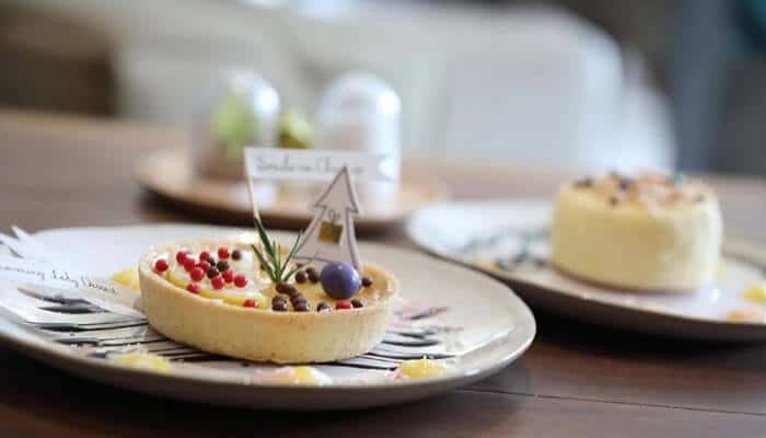
Minimalist white boxes are well suited to events where the dessert must coordinate with a wider visual theme.
Wedding planners, corporate clients, and event hosts often prefer neutral packaging because it does not conflict with decorations, flowers, table settings, or branded materials.
A white box can be adapted for:
- Weddings
- Engagement parties
- Baby showers
- Corporate events
- Product launches
- Anniversaries
- Luxury gifting
- Formal celebrations
The neutral foundation allows the customer or bakery to introduce occasion-specific details without creating visual clutter.
Minimalist Presentation Photographs Well
Bakery products are frequently photographed for social media, online reviews, event albums, and promotional content.
Simple packaging provides a clean visual environment that keeps attention on the dessert. It also makes brand elements easier to recognize in photographs.
A photo-friendly minimalist package may include:
- A visible but restrained logo
- A clean viewing window
- Uncluttered surfaces
- Strong contrast
- Neatly arranged products
- A short message inside the lid
The design should remain effective in natural lighting and from common viewing angles. A beautiful package that reflects excessive glare or hides the logo when photographed may be less useful for online sharing.
White Packaging Requires Careful Handling
White boxes can look exceptionally clean and premium, but they also reveal marks easily.
Grease, fingerprints, dust, frosting, scratches, and moisture may be more noticeable on a white surface than on darker or patterned packaging.
Bakery employees should be trained to:
- Handle boxes with clean, dry hands
- Keep packaging away from preparation spills
- Avoid placing boxes directly on the floor
- Inspect surfaces before use
- Position labels carefully
- Remove damaged boxes from inventory
- Perform a final presentation check
The bakery should also choose board and surface finishes appropriate for the product’s grease and moisture levels.
Structure Still Matters More Than Appearance
A minimalist box must protect the dessert as effectively as any other package.
Clean design cannot compensate for weak corners, an unstable base, poor closure, or insufficient lid height. Elegant desserts are often delicate and may require stronger structural support than simpler baked goods.
The box should be selected according to:
- Product size
- Product weight
- Decoration height
- Moisture content
- Delivery distance
- Stacking requirements
- Carrying method
- Storage conditions
Cake boards, cupcake inserts, dividers, and reinforced bases may be necessary even when the exterior remains visually simple.
Windows Must Stay Clean and Clear
Transparent panels are highly effective in minimalist packaging because they allow the product to provide much of the visual interest.
However, scratches, fingerprints, condensation, and frosting marks can quickly reduce the premium effect.
To maintain clarity, bakeries should:
- Store window boxes carefully
- Handle clear panels by the edges
- Allow warm products to cool before packing
- Use appropriate ventilation
- Prevent the product from touching the window
- Inspect the box before customer handover
The window material should also be securely attached and appropriate for the intended packaging use.
Minimalism Can Reduce Unnecessary Packaging
A restrained design philosophy can support more efficient packaging decisions.
Instead of adding multiple ribbons, sleeves, tissue layers, tags, and decorative inserts, the bakery can focus on a strong box, accurate fit, and one or two meaningful brand details.
This may reduce:
- Material use
- Packaging costs
- Assembly time
- Storage complexity
- Customer disposal effort
- Visual clutter
However, minimalist appearance does not automatically mean the package is environmentally preferable. Material composition, coatings, window film, adhesives, production methods, and local disposal systems still matter.
Environmental claims should always be based on verified packaging information.
Personalized Details Can Remain Subtle
Minimalist presentation does not prevent personalization.
Small, carefully selected details can make an order feel special without disrupting the clean design.
Possible additions include:
- A customer’s name
- A short handwritten note
- A small occasion sticker
- A printed gift message
- A simple ribbon
- A removable branded sleeve
- A discreet loyalty card
Personalization works best when it follows the same visual language as the rest of the packaging.
Minimal Packaging Can Improve Operational Consistency
A simple packaging system may be easier for staff to use consistently.
When the bakery works with a limited number of box styles, employees can become familiar with assembly, product placement, label positioning, and quality checks.
Operational benefits may include:
- Faster packing
- Fewer assembly mistakes
- Easier staff training
- Simpler inventory management
- More consistent presentation
- Reduced packaging waste
A neutral white box can also be used across multiple product lines, with labels or inserts providing the necessary variation.
Test the Complete Presentation
Before ordering minimalist packaging in bulk, bakeries should test the complete customer experience.
A physical sample should be evaluated with the actual dessert inside. Important questions include:
- Does the box fit correctly?
- Is the product centered?
- Does the lid clear the decoration?
- Is the window positioned effectively?
- Does the white surface mark easily?
- Is the box comfortable to carry?
- Does the product move during delivery?
- Is the branding visible?
- Does the package still look premium after transport?
Testing should include input from bakery staff, delivery drivers, and customers.
Common Minimalist Packaging Mistakes
Minimalist design appears simple, but several errors can weaken its effectiveness:
- Using low-quality material
- Leaving too much empty space
- Selecting an unreadable font
- Making the logo too small
- Using poor product arrangement
- Allowing visible fingerprints
- Choosing a box that is too large
- Adding random decorative accents
- Ignoring structural strength
- Removing necessary product information
Good minimalist design feels deliberate. Poor minimalist design can appear unfinished or generic.
Conclusion
Minimalist bakery presentation works well for elegant desserts because it allows craftsmanship, color, texture, and decoration to remain the main focus. Clean surfaces, restrained branding, carefully selected typography, and thoughtful product arrangement can make baked goods feel more refined and valuable.
White packaging is particularly effective because it provides a neutral, polished background that adapts easily to weddings, premium gifts, corporate events, and seasonal collections. Window designs add another layer of impact by allowing the dessert itself to become part of the visual presentation.
The success of minimalist packaging depends on precision. Materials must be strong, windows must remain clear, products must be arranged carefully, and every printed element must have a purpose.
When simplicity is supported by excellent construction and consistent execution, the package becomes an elegant frame for the dessert helping customers appreciate its quality before the box is even opened.
