Did you know that a person, on average across various industries, doesn’t stay on a webpage for more than 54 seconds? That means you, as the webmaster, have 54 seconds to catch a visitor’s attention.
And yes, it may seem like a small number. But it is entirely possible to incentivize visitors to stay on your page for longer than 54 seconds. But that’s not an easy task. You need an eye for aesthetics and a keen design acumen.
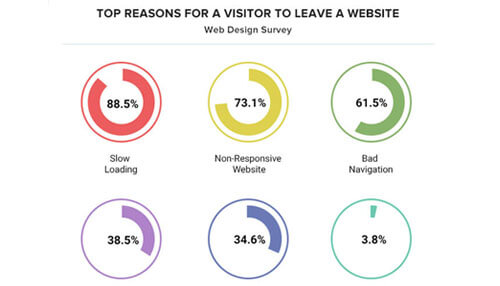
The following graphic shows the top reasons why a visitor leaves a website.
Now, if you know you don’t have these skills, it’s best to hire a UI designer from India that does. Why India? Because that’s where all the talented designers are.
But, if you’re confident in your abilities and still want to try your hand at UI designing, read this article to know where to start.
8 Tactics for Improving your Website’s UI/UX
1. Optimize the site speed
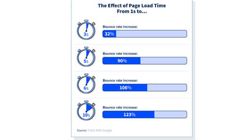
Remember when we mentioned that people don’t stay on a site for long? Slow speed is one of the main reasons why. Since consumers have so many options these days, if your website fails to load, it’s easier for them to just move on.
A site is said to have a good load time if it loads within 1-2 seconds. 53% of mobile sites are abandoned if it takes more than 3 seconds to load.
How to optimize your site speed?
1. Use a content delivery network: A CDN will help distribute your web content depending on their location.
2. Reduce the number of plugins: Plugins tend to leech a page’s resources. You can optimize your plugins by choosing high-quality plugins.
3. Minimize JS and CSS files: More the CSS files, the more HTTP requests. This will slow down the website.
2. Keep the sign-ups and pop-ups to a minimum
One main thing to remember when designing the UX of a website is not to annoy your visitors. Too many pop-up notifications tend to annoy visitors. So steer clear of that.
Use pop-up notifications only when absolutely necessary. Autoplay videos are another element that tends to confuse visitors and may destroy the UX.
Similarly, too many notifications to push visitors to sign-up may also ruin a user’s experience. Even if you’re including a sign-up form, don’t ask for more than 5 details. The longer the sign-up sheet is, the more the abandonment rate.
3. Be deliberate about the site navigation
A talented UX designer can make the visitor go where they want them to. How? By creating an organic site navigation pathway that most users will likely take. This will, in turn, improve the user experience on your website.
Here’s how you can improve your site’s navigation.
1. Show category separations clearly: When categories are obviously separated, users have an easier time finding the content they want.
2. Navigation elements should be hyperlinked: Sometimes, a page appears to be clickable, but actually isn’t. This could be because the designer forgot to add the hyperlink or maybe it was intended to be this way. But this design tends to confuse users. So avoid it.
3. Make your website search-friendly: In-site search bars are a hit or a miss. On some websites, it doesn’t pull up results unless the spellings are all accurate. This may tend to annoy users. Make the in-site search user-friendly.
4. Use sufficient white space
A webpage starts white. And there is no greater force compelling you to fill in all the gaps. So don’t. A cluttered page is your worst enemy. It is the first sign of a website that has been built without the TLC that it deserves.
The viewer needs a respite from all the heavy content that is displayed on a website. And white space will offer them this respite. You can also use white space to draw attention to successive sections of your webpage.
The easiest way to create white space is by giving sufficient room between each of your elements. Having fewer elements on your page will also improve your site’s loading speed.
5. Be strategic about your content
Optimize your content for search intent. Try to lessen the number of times a visitor has to click to get to their desired page.
Use your page’s content to convey your brand’s intent to your customer. Don’t create content blocks on your page. This will create a sense of clutter that might make your customer click away.
Instead, divide your content into sections that make sense. Then place the content blocks into the areas of your page that visitors are likely to look at. This will ensure that your page content gets read, and even better, experienced.
6. Be consistent
Nothing is more disorienting than a website that uses 10 different font faces in 7 different sizes. Pick a theme and stick to it. Typography is a huge influencer in website design. Make sure the UI designer your hire is well-versed in the rules.
Colors are another factor that you need to be consistent about. Pick a theme that matches your brand’s voice. Then, apply that theme throughout your website. This will help your customers associate your brand with those colors easier.
Finally, your image inclusions should also have uniformity. Don’t center one image and make another left-aligned without any rhyme or reason. If you’re using clipart on one page, don’t use stock images on another.
7. Make elements stand out
All elements are placed on a website very deliberately. So it shouldn’t be camouflaged into the page. Some elements need to stand out. Design your page such that they do.
- Hyperlinks: Hyperlinks are possibly the most important part of your page. Links are what drive conversions. So ensure that links stand out. The classic, blue underlined text, is something that internet users have come to associate with links. So continue using these colors.
- Headings: Keywords are a must in headings. And the heading text, itself, should stand out amongst all the other information on the page.
- Images: Include high-quality images and optimize them for loading time. This will convince your users that you’re a legitimate brand.
- Bullet Points: Notice how this segment was also in a bullet list? It probably caught your eye, right? That is the same way visitors to your website will react, as well. So be deliberate about including bulleted lists.
8. Use a mobile-responsive design
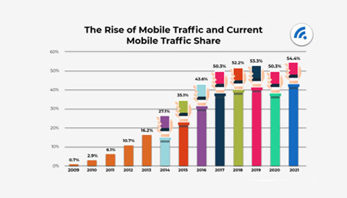
This one cannot be overstated. Most internet users use the website through their mobile phones. Specifically, 62.06%. But you also get a hefty amount of conversions from desktop users.
That is why your website should be accessible to both types of users. There are many drag-and-drop builders that allow you to automatically create a mobile responsive page. Take advantage of those when building your website.
In summary
A website UI/UX decides if it’ll get returning customers or not. If you want your page to have returning visitors, give priority to the UX. If you can’t handle it, then pass the torche to someone who can. Because the UI is not something you should compromise on.
Use these 8 tips to build a page customers would love to spend time on.


