


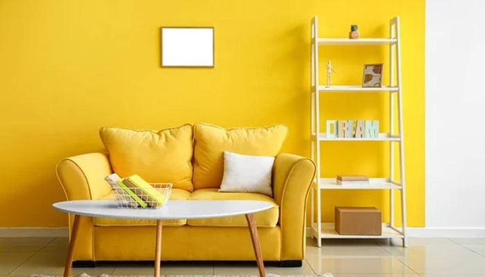

Butter yellow has been difficult to escape this year. Soft, creamy and much easier to decorate with than brighter yellows, it became one of 2026’s defining colours, appearing across kitchens, bedrooms, furniture and accessories.
But as summer gives way to autumn, yellow isn’t disappearing. Instead, it’s getting deeper. Pale buttery shades are making way for mustard, ochre, honey and golden tones that bring the same warmth with a more seasonal feel.
Why Butter Yellow Worked So Well
Part of butter yellow’s appeal is its softness. Sitting somewhere between cream, beige and traditional yellow, it brings colour into a room without demanding too much attention.
It also arrived at the right moment. After years dominated by cool greys and crisp neutrals, interiors have been moving towards warmer, more comforting palettes. Butter yellow offered an approachable way to make that shift without committing to anything particularly bold.
Paired with warm white, natural timber, soft blue or earthy green, it can behave almost like a neutral. That versatility helped it move beyond a passing accent colour and into larger design choices, including cabinetry, walls and upholstered furniture.
Yellow Is Getting Richer for Autumn
Autumn doesn’t necessarily mean replacing butter yellow. The easiest way to make the trend feel more seasonal is simply to deepen the palette around it.
Mustard, ochre, amber and honey all belong to the same warm colour family but have more depth. Where butter yellow feels fresh and light, these shades feel grounded and cosy.
Think less bright sunflower and more autumn leaves, golden-hour light and warm spices. These earthier versions of yellow also sit naturally alongside many of the colours already associated with autumn, including burgundy, chocolate brown, olive green and terracotta.
A room decorated with butter yellow during summer can therefore evolve rather than undergo a complete seasonal makeover.
How to Transition Butter Yellow Into Autumn
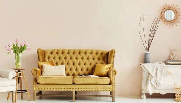
Start by layering darker shades alongside the yellow already in the room. A butter yellow wall, for example, can stay exactly where it is while cushions, throws or curtains introduce ochre, rust or deep brown.
Texture makes a noticeable difference too. Lightweight cotton and linen feel naturally summery, whereas brushed fabrics, wool, boucle and velvet give yellow more weight for autumn.
Wood is particularly effective alongside these shades. Medium and darker timber furniture can ground pale yellow, while warm wood flooring creates a natural base for mustard and ochre accents. Even lighter oak can work beautifully when paired with deeper brown and rust elsewhere in the scheme.
There’s no need for every yellow to match, either. Combining butter, honey and mustard can create a layered palette that feels much more relaxed than sticking rigidly to one shade.
Try Mustard as an Accent First
Mustard can look intense on a paint chart, particularly after the softness of butter yellow. Using it in smaller doses is an easy way to test whether it works with an existing scheme.
A mustard armchair can add warmth to a neutral living room, while a patterned rug containing ochre can connect yellow walls with darker wood-effect flooring or furniture. Lampshades, cushions, ceramics and artwork offer even smaller opportunities to experiment.
For a more confident approach, mustard works surprisingly well across kitchen cabinetry, a feature wall or built-in storage. Keeping surrounding materials understated prevents the colour from becoming overwhelming.
The Colours That Work Best With Autumn Yellow
One reason yellow transitions so successfully between seasons is the number of colours that complement it.
Chocolate and walnut brown bring out its warmer side, while burgundy creates a richer, slightly more dramatic combination. Olive and moss green offer an earthy alternative, particularly alongside natural timber and woven textures.
Blue can stay in the palette too. Rather than summer’s powdery shades, consider navy, petrol or muted denim. Against mustard or ochre, these cooler colours provide contrast without making the room feel cold.
For a calmer scheme, warm whites, taupe and beige allow yellow to remain the main source of colour while keeping the overall look understated.
Does Butter Yellow Still Have a Place?
Definitely. Seasonal decorating doesn’t have to mean abandoning colours as soon as the weather changes.
Butter yellow can remain the lighter part of an autumn palette, particularly in rooms that benefit from brightness. The change comes from what surrounds it: richer textiles, deeper woods, earthy colours and warmer lighting can completely alter how the shade feels.
That makes the yellow trend surprisingly practical. Rather than jumping from one fashionable colour to another, the move from butter to mustard shows how a palette can evolve gradually throughout the year.
